Card
A card is a group of related information, generally comprising of an Image, headers and footers, a wide variety of content, and sometimes also has a call to action button. In order to only use the Button Component from Blaze UI in your project, copy and paste the below code in the head tag of your html document.
                <link rel="stylesheet" href="https://blaze-ui.netlify.app/css/foundation.css" />
                <link rel="stylesheet" href="https://blaze-ui.netlify.app/components/card/card.css" />
                <link rel="stylesheet" href="https://blaze-ui.netlify.app/components/image/image.css" />
                <link rel="stylesheet" href="https://blaze-ui.netlify.app/components/button/button.css" />
Card with Badge
This card has a badge on the top-left corner. To use the Card with Badge you just need to add class name card-badge. You can copy the html part from below code snippet.
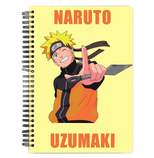
Naruto Notebook
Accessories
                    <div class="card-badge">
                        <div class="card-header">
                            <img class="img-responsive" src="/assets/naruto_nb.jpg" alt="naruto themed notebook" />
                            <div class="badge-in-card">
                                TRENDING
                            </div>
                            <div class="card-floating-icon">
                                <i class="far fa-heart"></i>
                            </div>
                            <div class="card-header-txt">
                                <h3 class="semibold">Naruto Notebook</h3>
                                <small class="gray-color">Accessories</small>
                                <div class="card-price">
                                    <span class="final-price t1p5 lightbold">₹2499</span>
                                    <span class="initial-price t-strike">₹4499</span>
                                    <span class="discount primary-color">Save ₹2000 (44%)</span>
                                </div>
                            </div>
                        </div>
                        <button class="btn-primary card-btn">
                            Add to Cart
                        </button>
                    </div>
Card with Text Overlay
This card has a text overlay on top of it. To use the Card with Text Overlay you can copy the html from below code snippet.
Naruto Notebook
Accessories
                    <div class="card-badge card-txt-overlay">
                        <div class="card-header">
                            <img class="img-responsive" src="/assets/naruto_nb.jpg" alt="naruto themed notebook" />
                            <div class="badge-in-card">
                                TRENDING
                            </div>
                            <div class="card-floating-icon">
                                <i class="far fa-heart"></i>
                            </div>
                            <div class="card-header-txt">
                                <h3 class="semibold">Naruto Notebook</h3>
                                <small class="gray-color">Accessories</small>
                                <div class="card-price">
                                    <span class="final-price t1p5 lightbold">₹2499</span>
                                    <span class="initial-price t-strike">₹4499</span>
                                    <span class="discount primary-color">Save ₹2000 (44%)</span>
                                </div>
                            </div>
                        </div>
                        <button class="btn-primary card-btn">
                            Add to Cart
                        </button>
                        <div class="overlay-msg t2 lightbold">Out of Stock</div>
                    </div>
Horizontal Card
The horizontal card is completely responsive, as it turns into a vertical card on devices with small screens. To use this card, you just need to add class name card-horizontal. You can copy the html part from below code snippet.
Naruto Notebook
Accessories
                    <div class="card-horizontal">
                        <div class="img-in-horizontal">
                            <img class="img-responsive" src="/assets/naruto_nb.jpg" alt="naruto themed notebook" />
                        </div>
                        <div class="card-header">
                            <div class="card-header-txt">
                                <h3 class="semibold">Naruto Notebook</h3>
                                <small class="gray-color">Accessories</small>
                                <div class="card-price">
                                    <span class="final-price t1p5 lightbold">₹2499</span>
                                    <span class="initial-price t-strike">₹4499</span>
                                    <span class="discount primary-color">Save ₹2000 (44%)</span>
                                </div>
                            </div>
                            <button class="btn-primary card-btn">
                                Add to Cart
                            </button>
                            <button class="btn-primary btn-outline card-btn">
                                Save to Wishlist
                            </button>
                        </div>
                    </div>
Text only Card
Text only card includes a title and a paragraph text. To use the this card you just need to add class name card-txt-only. You can copy the html part from below code snippet.
Card Title
I am a text only card. I am a text only card. Yup, I said that twice, that was thoroughly planned and you fell for it!
Card Title
Sub-TitleI am a text only card. I am a text only card. Yup, I said that twice, that was thoroughly planned and you fell for it again!
                    <div class="card-txt-only">
                        <h4>Card Title</h4>
                        <p>I am a text only card. I am a text only card.
                        Yup, I said that twice, that was thoroughly planned and you fell for it!</p>
                    </div>
                    <!-- Second Variation for Text Only Card -->
                    <div class="card-txt-only">
                        <h4>Card Title</h4>
                        <small>Sub-Title</small>
                        <p>I am a text only card. I am a text only card.
                        Yup, I said that twice, that was thoroughly planned and you fell for it again!</p>
                    </div>
Card with Dismiss
Card with Dismiss includes a icon on top right corner which acts as a dismiss button. To use the this card you just need to add class name card-dismiss. You can copy the html part from below code snippet.
Card Title
Sub-TitleI am a card with dismiss. I am a card with dismiss. Yup, I said that twice, that was thoroughly planned and you keep falling for it!
                        <div class="card-dismiss">
                            <h4>Card Title</h4>
                            <i class="fas fa-times"></i>
                            <small>Sub-Title</small>
                            <p>I am a card with dismiss. I am a card with dismiss.
                            Yup, I said that twice, that was thoroughly planned and you
                            keep falling for it!</p>
                        </div>
Card with Shadow
This card has a very nice elevated effect due to shadow. To have this shadow effect in your card, you just need to add class name card-shadow along with any other type of card. You can copy the html part from below code snippet.
Naruto Notebook
Accessories
                    <div class="card-badge card-shadow">
                        <div class="card-header">
                            <img class="img-responsive" src="/assets/naruto_nb.jpg" alt="naruto themed notebook" />
                            <div class="badge-in-card">
                                TRENDING
                            </div>
                            <div class="card-floating-icon">
                                <i class="far fa-heart"></i>
                            </div>
                            <div class="card-header-txt">
                                <h3 class="semibold">Naruto Notebook</h3>
                                <small class="gray-color">Accessories</small>
                                <div class="card-price">
                                    <span class="final-price t1p5 lightbold">₹2499</span>
                                    <span class="initial-price t-strike">₹4499</span>
                                    <span class="discount primary-color">Save ₹2000 (44%)</span>
                                </div>
                            </div>
                        </div>
                        <button class="btn-primary card-btn">
                            Add to Cart
                        </button>
                    </div>